
A website is a vital aspect of a company’s performance. It allows your business to have an online store that is available to your target audience 24/7. More importantly, companies must ensure to have a website that has a great design. Web design comes into play to make your website user-friendly, aesthetically pleasing, easily navigable and much more. Statistics show that these website characteristics are crucial for a business. In fact, 94% of first impressions are related to your website’s design and 89% of consumers will shop with a competitor after a poor website user experience. Based on these stats, it goes without saying that your website’s design is a critical part of your business’s success.
A Quick Description of Website Design
Website design involves everything on a user experience and user interface standpoint of a website. User experience (UX) involves improving the emotions and attitudes users have towards your website by making the website user-friendly, engaging, and so on. User interface (UI) involves improving the interactions between the user and website by making the website visually appealing, interactive, and much more. By properly implementing both of these aspects, users will have a seamless website browsing experience on a beautifully designed website.

Ottawa Web Design
As an Ottawa-based company, we often find ourselves talking about great businesses in Ottawa that we think could see immense growth through the update of their website. For this reason, we’ve decided to make a blog to help our readers and these Ottawa businesses understand the strengths and weaknesses of their website.
Fitness Depot‘s Website
Our first Ottawa web design blog will be about the Fitness Depot, an exercise equipment superstore franchise in North America. A few members of the myMarketing team have been clients at this store for many years and love to buy their products.
The Fitness Depot website has both pros and cons to it. We will review the website by highlighting and analyzing each element from a design standpoint and provide suggestions on how to improve them. This will allow you to see which design modifications go hand in hand with your own website and will help you learn how to improve them. Without further ado, let’s analyze the Fitness Depot website to discover which elements of the website design are strong and which elements need some work.

Website Strengths
Before we analyze the flaws of this website and discuss what they could improve, let’s look at the elements the website has successfully accomplished.
Website Branding Design
The Fitness Depot has successfully implemented its branding design on its website. The website includes branding colours that are common for both their logo as well as their offline stores. Additionally, the typography used throughout the website goes hand in hand with the Fitness Depot brand. This is a job well done by the Fitness depot as it helps its audience associate the website with the Fitness Depot brand.
Website Responsiveness
This Canadian-based business has relatively good website responsiveness. The website worked well on mobile, tablet, and various computer screen sizes. As you can see in the screenshot below, the homepage is responsive to each device. The website also comprises multiple other pages, each of which is fairly well optimized for responsiveness. It must be noted that although the responsiveness is good overall, there are some minor flaws that should be
Desktop
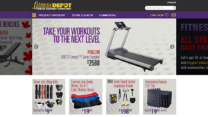
Tablet
Mobile
Website Content
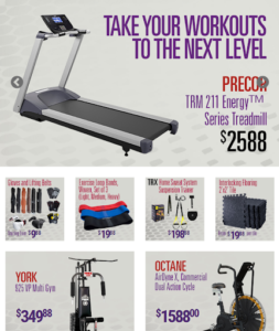
Although content is not directly related to the website design, we need to give credit to Fitness Depot for their content. Each page of the website includes valuable, useful, and actionable content tailored for the target audience. Examples of the content on this website can be seen below.
As you can see in the top section of the Fitness Depot homepage, there is inspiring and motivational content that is very relatable to the target audience.
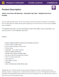
Under each product, the user will find a product description that includes the name, category, highlights, specifics, features, and much more about the product. Having this content available to the user reduces many of the doubts associated with the buying process.
Website Drawbacks
While Fitness Depot has managed to design a well-branded responsive website with strong content, there are some definite drawbacks to it as well. Let’s take a look at some of the elements we believe require some substantial updates or modifications.
Website Visual Design
One aspect of the brand’s website that needs work is its visual design. The visuals of the website are below common consumer expectations and are lower than the industry standard. As shown below, the design is outdated and lacks a professional touch which hampers the aesthetics of the website.

Take for example the Under Armour website, you may notice that the website design is completely different. Here are a few characteristics from the screenshot above that the Under Armour website does not include.
- Images covered with text
- Colours that do not match
- Visuals that are crowded rather than simplistic
The differences in design between these two websites are what give the Under Armour brand a much more professional and new look as opposed to the Fitness Depot website.
Website Engagement
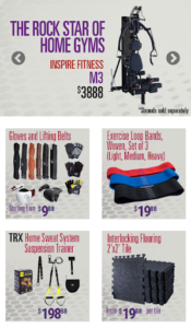
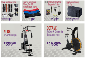
Once again, the Fitness Depot website needs attention from an engagement standpoint. As shown below, the website includes boxes with basic product images and brief descriptions. This content does not come across as inspiring and appealing to the user as it is almost entirely product-centric rather than customer-centric. Adopting a mix of both customer and product-centric approaches could be beneficial as customers will be able to better associate the product with their needs and desires.
Take for example the website of well-known fitness brands such as Nike or HEAD, you’ll notice that almost all these websites focus on the customer rather than just the product. This makes the website much more engaging, inspiring, and appealing for the target audience.
Website Usability
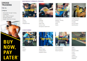
Although the website is easy to navigate due to the easy-to-use menu bar, the overall customer buying process is ineffective. There are very few calls to action that redirect customers from page to page to lead them towards the product they are searching for. Additionally, once buyers find the product they are looking for, it can be difficult for them to understand how to buy it.
Here are a few other major aspects that tend to spoil the usability of the website.
- Absence of a shopping cart for the user to save products they are interested in.
- Very few to no reviews for each product.
- Absence of a buy online or reserve in-store call to action.
Website Layout
The website layout of the brand does not stand up to its expectations. The attempt to display many products with insufficient spacing has left the website overcrowded, repetitive, and sometimes unbalanced. As you see pictured below, the homepage and the products page have a few flaws to them.
- The homepage has design elements with different margins making the overall layout look uneven.
- The banner on the left side of the product page gives the impression of an advertisement and doesn’t flow properly with the rest of the page.
- The subcategories below each main category of the product page are written in plain text with no indication that the respective page is linked.
These elements make the layout somewhat displeasing and diminish the overall quality of the website.
The Missing Touch: User Experience and User Interface
As mentioned at the beginning of this blog, website user experience is a combination of elements that make the experience of the user enjoyable and effective when using the website. On the other hand, the user interface complements the user experience by determining the aesthetics of the website along with its interactivity and presentation.
As for the Fitness Depot website, while the user experience is moderate, the brand lacks professionalism and quality when it comes to its user interface. Due to an overall outdated appearance, the website does not manage to represent the business properly.
Importance of good User Experience and User Interface
User experience (UX) and user interface (UI) have a vital role to play in improving the performance of a website. By successfully implementing the UX and UI of a website, customers are more likely to be satisfied and your business is more likely to accomplish their website goals.
Good user experience and user interface help accomplish the following objectives.
- Increase customer engagement and conversion
- Enhance brand credibility and perception
- Rake in higher sales, revenues, and profits
- Improve website performance metrics
To learn more about the benefits and the importance of UX and UI, visit our user experience and user interface service pages.
Final Thoughts
As discussed throughout this blog, your website design can make or break the performance of your business. We suggest that all businesses prioritize the quality of their website to successfully attract, convert and retain their audience.
If you would like to learn more about website design, feel free to reach out to one of our experts at myMarketing.
Would you like to be the next business that receives a website design analysis? Send us a message!

