
Managing a restaurant is not an easy task, especially in today’s digital era when the internet has overtaken every aspect of our lives. Today, when most consumers cannot spend a single day without browsing the internet, it becomes necessary for businesses like restaurants to invest in a quality website design.
Your restaurant’s website gives you full control over the content you promote and connects you with potential customers. It creates the first impression of your business and gives the opportunity to increase demand for your restaurant. Thus, to run a successful restaurant, especially in this highly competitive industry, it is crucial to invest in website design.
Top Web Design Characteristics of Restaurants in Ottawa
Whether you wish to increase your brand awareness or enhance sales, website design can be the difference between a new lead and or lost customer. Here are some of the characteristics for which we will evaluate the top 3 restaurants in Ottawa.
Website Written Content: Content is an important aspect of a restaurant’s website. It delivers the message you want to convey to your audience and presents the benefits or offers that are of importance to them. Effective content will allow you to attract and convert prospects as well as retain current customers.
Website User Experience: User experience is referred to the attitude or emotion a user experiences when visiting a website. User experience is a combination of all factors like structure, responsiveness, navigation and the speed of a website. Missing one or more of these components decreases the chances of attracting and captivating an audience.
Website User Interface: The user interface is how a website interacts with its visitors. It refers to the visual aesthetics of a website. User interface and experience complement each other and play a great role in attracting and engaging the audience for a longer span of time.
Top 3 Restaurants in Ottawa Website Design Review
Here are the top 3 restaurants in Ottawa that were featured in Ottawa Magazine, along with brief reviews of their website design.
Alice
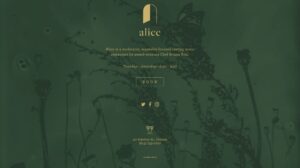
Alice is a locally owned restaurant in Ottawa that caters to plant-based diets. Located at 40 Adeline St., it is a new venture by Gold Medal Plates winning chef Briana Kim, and known for its rich culinary experience.
Now let’s see how they have designed their website.
In the image above, you can see the screenshot of Alice’s entire website. Below is our review of their website on a scale of 0 to 10, with 0 being unsatisfactory and 10 being outstanding.
Written Content: 1/10
Website content plays a crucial role in promoting a business as it tells your story to visitors. In this context, Alice’s website has very minimal content. Due to this drawback, their consumers cannot easily access the information about the restaurant, which is likely to discourage them from reserving a table.
User Experience: 2/10
The webpage is user-friendly, it includes a great call-to-action and includes links to social media. That said, the website is way too short to ever qualify as a strong user experience. User experience is a factor that engages visitors with the website and helps to fulfill their needs. Since the website is minimal, prospective customers will not be able to access the information they are looking for.
User Interface: 2/10
The website is easy to navigate and has an attractive design. Although the site looks good, it is too short to satisfy the average user. The user interface is important as it improves your website’s appearance and aesthetic. Thus, due to the short length of this website, user involvement and interest are likely to be low.
Overall: 2/10
Overall, the website’s content is too limited and unclear to be granted a strong overall website review. Though it looks great and has a user-friendly interface, it could have featured its menu, product images, and other elements to improve its overall performance and attract potential customers. Unfortunately, due to their lack of content and short interface, we are rating this restaurant’s website a 2 out of 10.
Stofa
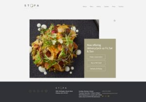
Stofa is yet another restaurant that has a unique menu and includes some unfamiliar, but pleasant ingredients. From starters to main courses, each of the items in the kitchen is handled with care by chef-owner, Jason Sawision.
As shown in the above image is their homepage. Here’s our brief analysis of the website:
Written Content: 6/10
Though the Stofa website features its menu, images of food and details of its chefs, it could have included more content such as the restaurant’s story, the dining experience and more. This would intrigue users and encourage them to make a reservation.
User Experience: 7/10
Overall, this is a well-designed website with a good user experience. However, there is a lack of sections on the homepage to provide customers with all the information they are looking for.
User Interface: 8/10
The appearance is professional with a good use of company branding. The layout of the content could be improved with the addition of more imagery representing the restaurant.
Overall: 7/10
Overall, we would say that this is a well-designed website with proper utilization of user experience and interface. However, they could consider adding more content to provide the visitors with all the information they may be searching for. The use of relevant and high-quality written content will provide value to visitors and increase the level of engagement.
Gray Jay
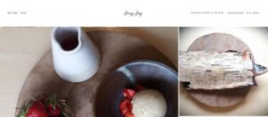
Introduced by chef Dominique Dufour, the food at Gray Jay is prepared using the selected Canadian ingredients. The menu is unconventional and provides a unique experience to visitors by allowing them to watch the chef cook meals.
The homepage in the above picture shows Gray Jay’s website homepage. Here are our thoughts on the site:
Written Content: 3/10
The website offers very little content in terms of details about the restaurant and the chefs. The omission of this valuable information could decrease the reader’s interest.
User Experience: 4/10
Though the website homepage is quite appealing, the website’s sections and webpages seem to be very limited overall. The website does provide a webpage with the menu and reservation option to its visitors, however, these pages offer very little information and visuals.
User Interface: 5/10
The aesthetics of the homepage are very pleasing due to the various pictures of the dining experience. However, other than the homepage, webpages have very little to no visual content to complement the writing. Overall, although the user interface is good, the website is much too short to properly judge this criteria.
Overall: 4/10
Gray Jay’s website design receives a relatively low score of 4 on 10 due to its lack of written content and website sections. To improve their score, they must add content that engages and creates value to their visitors such as additional information of their cuisines, dining experience and more.
Final Thoughts
As you can see from our analysis of these 3 leading restaurant websites, there is almost always room for improvements when it comes to having compelling content, strong user experience and user interface designs throughout a website. By incorporating the right changes to improve these elements, restaurants have the opportunity to create a website that is welcoming and accommodating for their customers.
To learn more about the benefits and the importance of content, UX, and UI visit our content marketing, user experience, and user interface pages.
Would you like to be the next business that receives a website design analysis? Send us a message!
